


Originally posted on The Score
Plenty of teams across the NHL will be sporting new uniforms this upcoming season. Some are permanent, others are celebratory, but all of them deserve to be ranked.
Below, we'll do just that for each of the 10 franchises that will rock something fresh this campaign.
Note: We omitted the Chicago Blackhawks' centennial jerseys since the changes were minor.
What's new: Road set with a different colored logo, stripes, and numbers
View this post on Instagram
It feels like the Hurricanes release a new version of the same uniform every season. The result is a lack of synergy with the team's overall identity. We respect trying something new, but removing the white that has been a part of the crest for the franchise's entire history was unnecessary. The giant sleeve stripes don't match the stripes at the bottom of the jersey, and the absence of details around the name and numbers leaves this look incomplete. Although we may be critical of Carolina here, this uniform is at least an upgrade over the "CANES" jersey the club has worn on the road in recent years.
What's new: "Fauxback" alternate jersey
— Edmonton Oilers (@EdmontonOilers) September 20, 2025
The Oilers took focus off their perfect primary color scheme in favor of a drab beige background and a forced cursive logo for their new alternates. They'll probably look fine on the ice, but this is an underwhelming design from the back-to-back Western Conference champs.
What's new: Red alternate jersey
View this post on Instagram
We have no problem with the Senators bringing back a red jersey, and the gold details really pop. However, square shoulder yokes are a miss. The sweater also feels incomplete without any notable striping at the bottom.
What's new: Alternate jersey
View this post on Instagram
You'd be hard-pressed to find a hockey fan who doesn't love Washington's screaming eagle logo, but this version is a downgrade compared to both the red and black alternates that featured it in recent years. Taking away the diagonal stripes to match the flight of the bird cheapens the aesthetic.
What's new: Alternate jersey
View this post on Instagram
The Kraken are leaning heavily into their deep-sea identity with this one. Adding stripes presents a significantly different idea than their primary set, and the glow-in-the-dark logo is a fun touch.
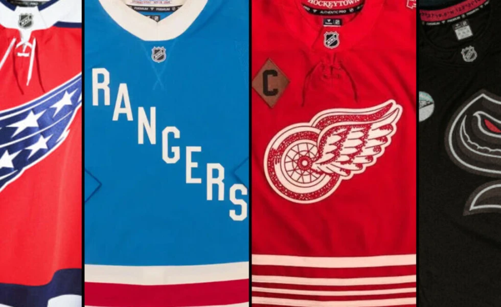
What's new: Alternate jersey for centennial season
View this post on Instagram
The Rangers are one of three original six franchises celebrating their 100th season in 2025-26, and these centennial uniforms certainly embody their identity. A blue backdrop with the diagonal "Rangers" lettering is famous on Broadway, and for good reason. Though New York never looks bad on home ice, these could be better with a simplified collar and perhaps some laces to emphasize the vintage vibes.
What's new: Primary uniforms with Mammoth logo
— Utah Mammoth (@utahmammoth) May 7, 2025
Utah's jerseys levelled up by implementing the popular new Mammoth logo. It fits seamlessly with the color scheme and completes a strong start for the league's newest team.
What's new: Tweaked home and away uniforms
View this post on Instagram
Boston got rid of its colored shoulders and simplified the famous "Spoked B" for a fresh new set of threads. It's a similar uniform to what the Bruins wore in the 1970s - or what Happy Gilmore donned when he fought Bob Barker - but some modern touches make this a near-perfect redesign. We love the bear silhouette on the shoulder, but yearn for the return of yellow socks with the home uniforms.
What's new: Home and away uniforms
View this post on Instagram
St. Louis sharpened its crest and drew inspiration from previous alternate jerseys to create its new primary set. The blue and yellow mesh perfectly together, creating a vintage style without trying too hard. Zero gripes about these.
What's new: Alternate jersey for centennial season
View this post on InstagramA post shared by Detroit Red Wings Hockey Club (@detroitredwings)
There's a reason Detroit has barely changed its uniforms over the past 100 years: you don't mess with perfection. The Red Wings had to get it right if they were going to celebrate their centennial boldly, and they did. The retro logo, stripes, and color scheme will shine on the ice, and the dark brown gloves are the cherry on top.
Copyright © 2025 Score Media Ventures Inc. All rights reserved. Certain content reproduced under license.
Originally posted on The Score
Published: 3 months ago
Oilerhockey is in no way affiliated with the NHL or the Edmonton Oilers hockey club.
Copyright © 2009 - 2026 oilerhockey.com | Contact us at admin@oilerhockey.com | View our Privacy Policy or DMCA Policy